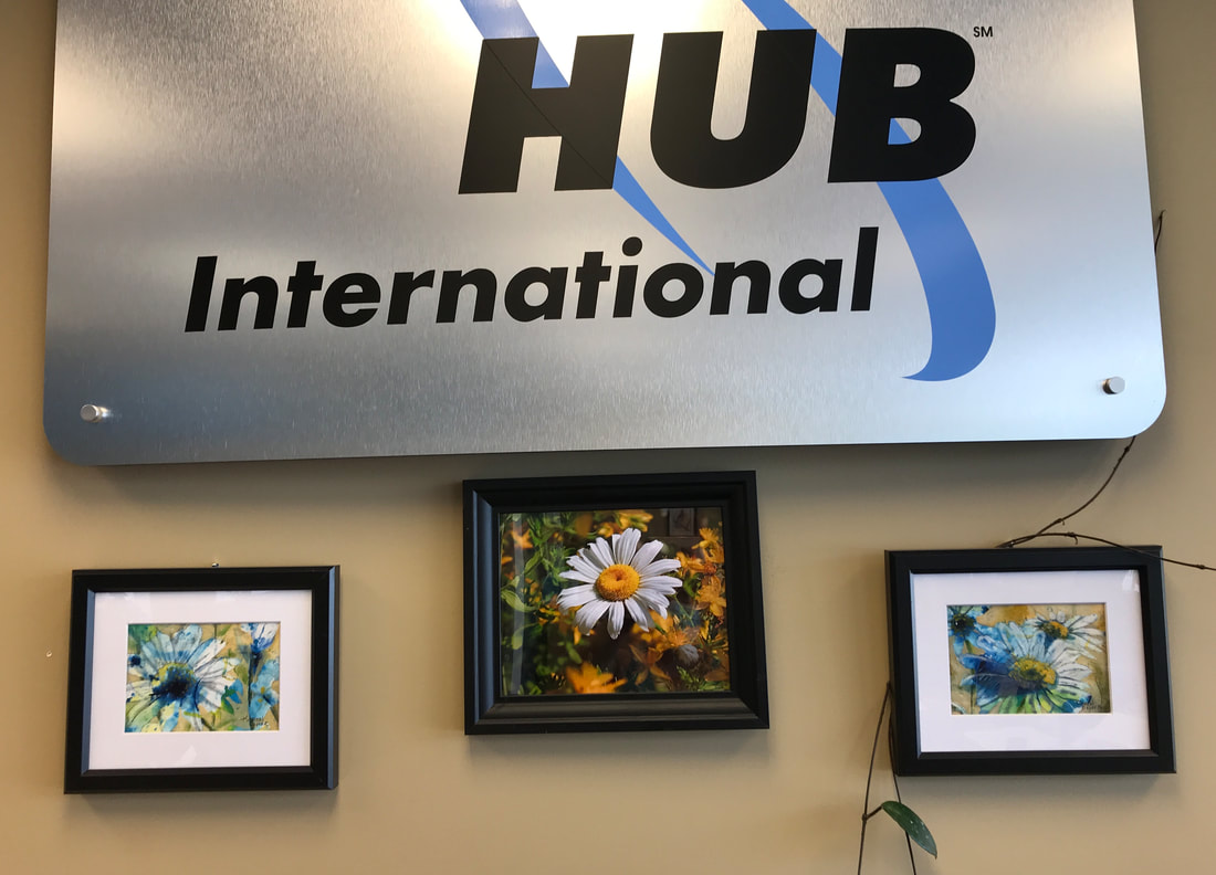
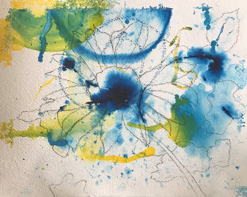
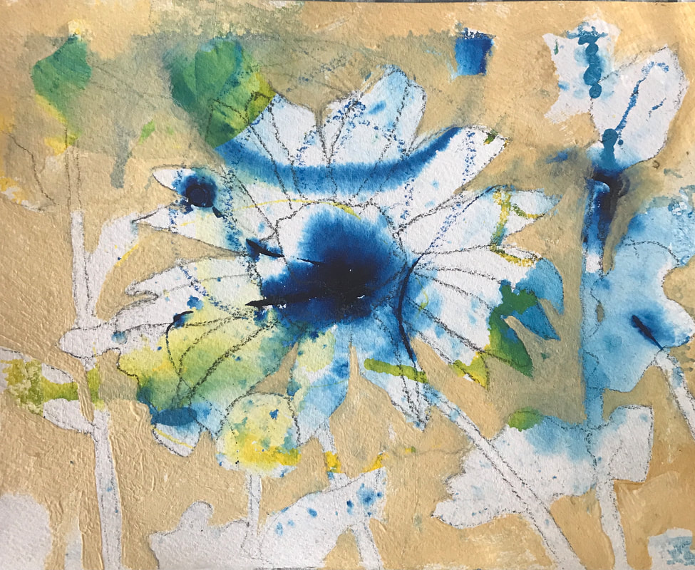
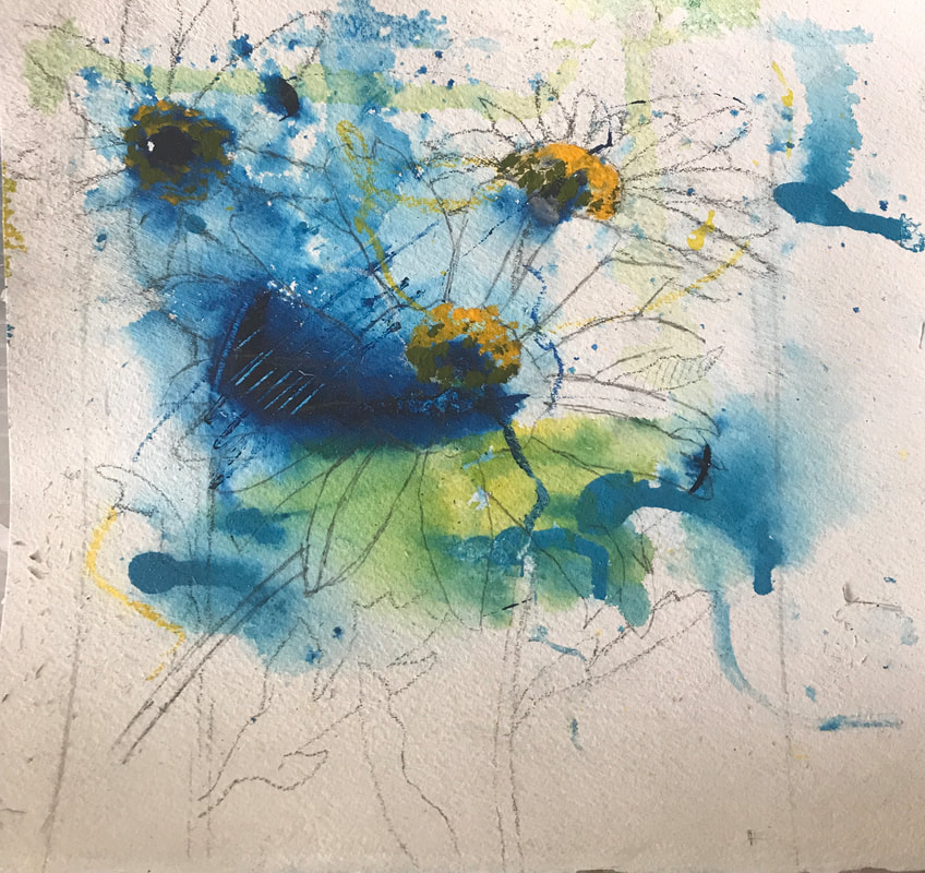
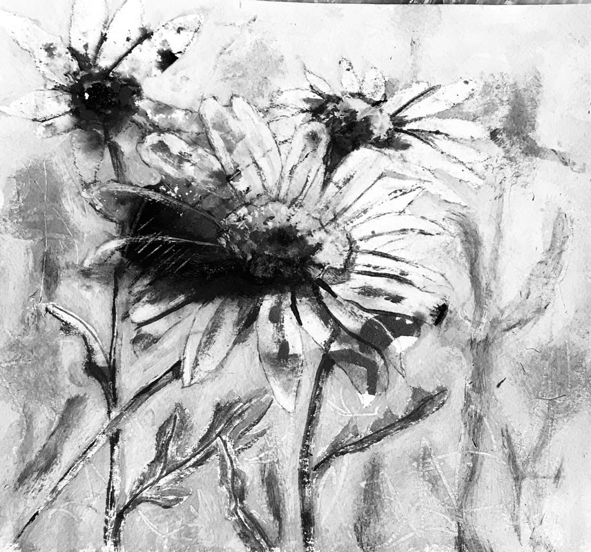
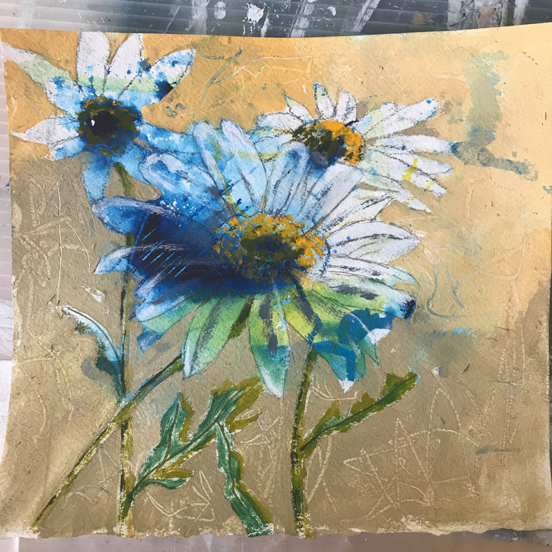
 It is wonderful when a local Sicamous business supports the local arts community. HUB International is a local insurance company located in Sicamous, B.C. The Eagle Valley Brush and Palette Club join with the Photography Club with a "Photo to Canvas" event. They have a whole collection all over the walls and welcome customers and those interested in photography and painting to come in for a look. A bin of photos is left for the artist's to choose and use as a reference for a painting. Some of the paintings are very realistic, following the photo and others are used for the idea as mine were. I painted two using mixed media on watercolour paper. The painting on the left in progress below. I will post the painting on the right in progress in my next post. 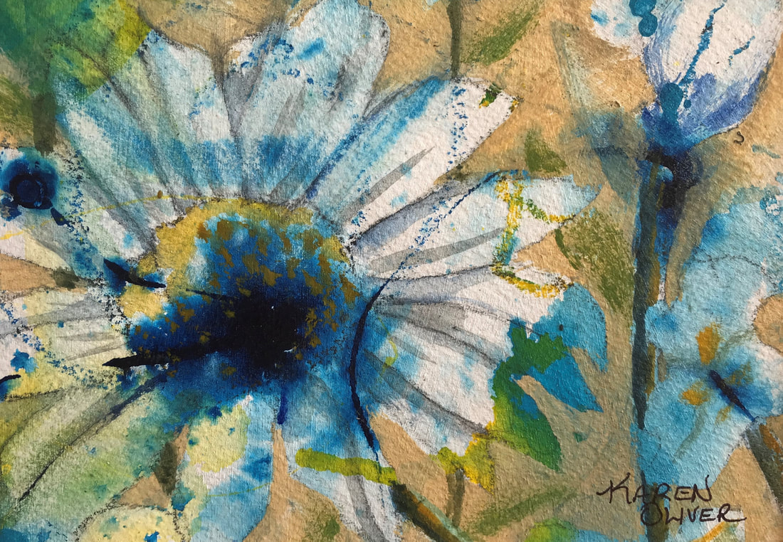
0 Comments
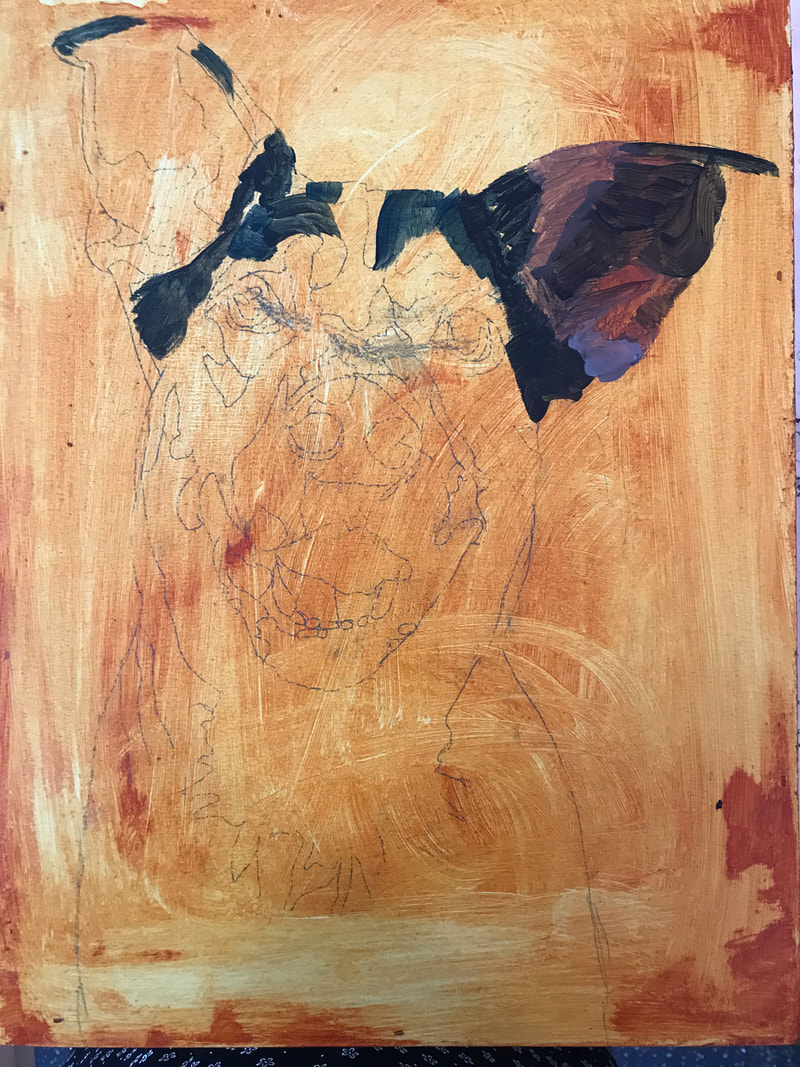
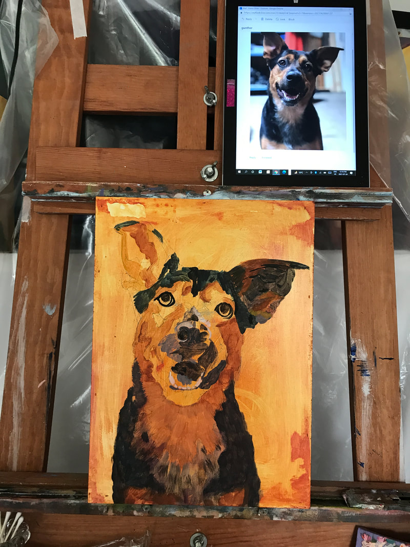
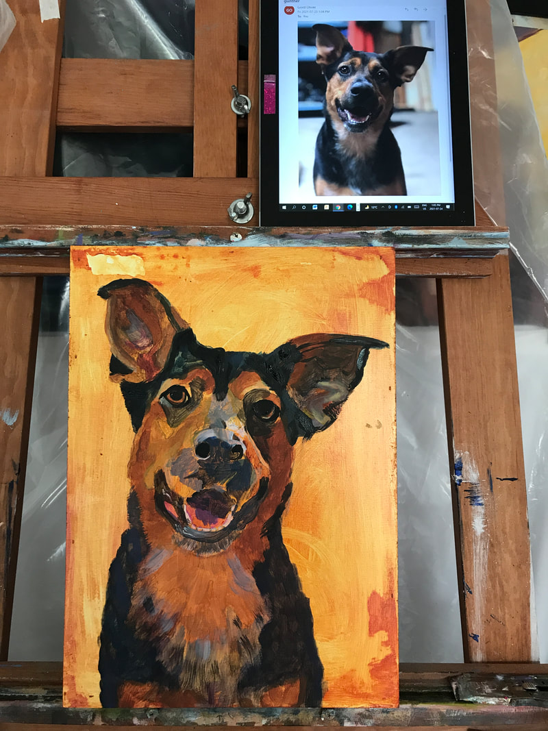
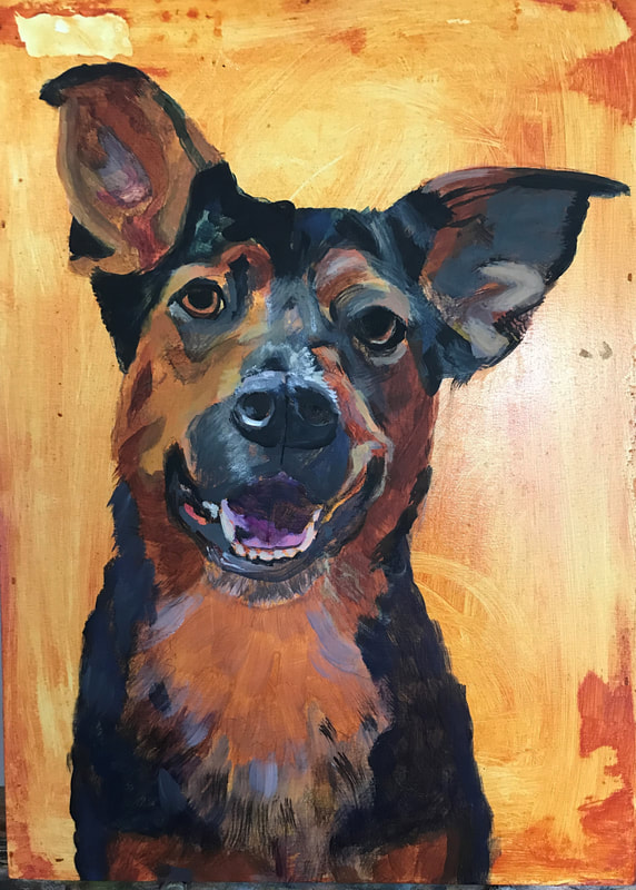
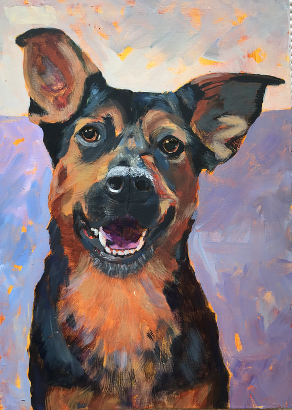
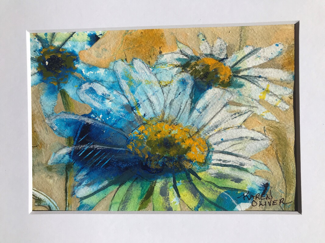 The Eagle Valley Brush and Palette Club in Sicamous, B.C. teams up with the Photography Club annually for this challenge. The photographers submit photographs and the painters choose what they are interested in and paints their rendition. Some artists choose very realistic rendention while others take the idea or essence of the photograph and paint it with their own voice as I did with the two mixed media paintings. Usually there is an exhibition at the Red Barn Arts Centre in Sicamous B.C. but of course with Covid, it was cancelled. HUB International insurance in Sicamous is a great supporter of this challenge and puts the photos and paintings all over their office for customers and interested people to come in and enjoy. Thank you HUB International!! Below are some pictures of the painting in progress. 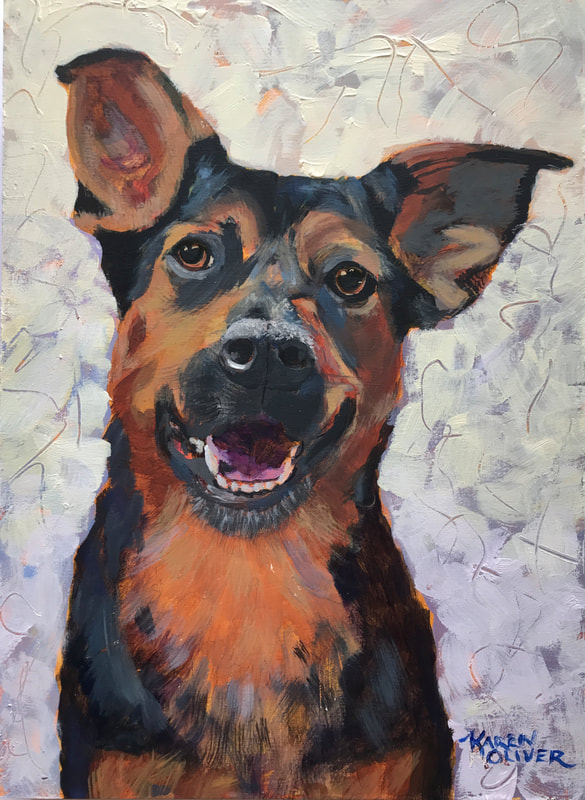 "Gunther" a commissioned wedding present pet portrait 14" x 10" Acrylic on wooden cradled panel #20025821 The cradled board was coated with GAC 100, then gesso'd. An underpainting of Quin Nickle Azo Gold was applied then I drew Gunther in. Following the reference photograph on my computer, I started painting with blues, purple, and browns to block in the shapes. Painting in the eyes near the end gave me the character and then I finished with mouth and nose details. I wasn't sure what colour to paint in the background so I chose two of the colours in Gunther's face. It felt like I had to much middle value in this painting and asked my online artist group (called 4C on Mighty Networks) for suggestions. I am very happy with how this painting turned out.
#petportrait #dogportrait #acrylicpetportrait #happypainting #petportraitweddinggift @karenoliversfineart #canadianartist #petportraitcommission #paintingcommission My Mom has moved into a senior's residence. Her new one bedroom apartment has beautiful full windows therefore less wall space. I had given her some of my favourite paintings to enjoy in her 2 bedroom condo and now that she doesn't have room, I will be able to enjoy them and then add them to my inventory. My website badly needs to be updated and I have been to busy with life's surprises to do any painting for the last three months so hopefully will get these added and others that have sold updated on my website. 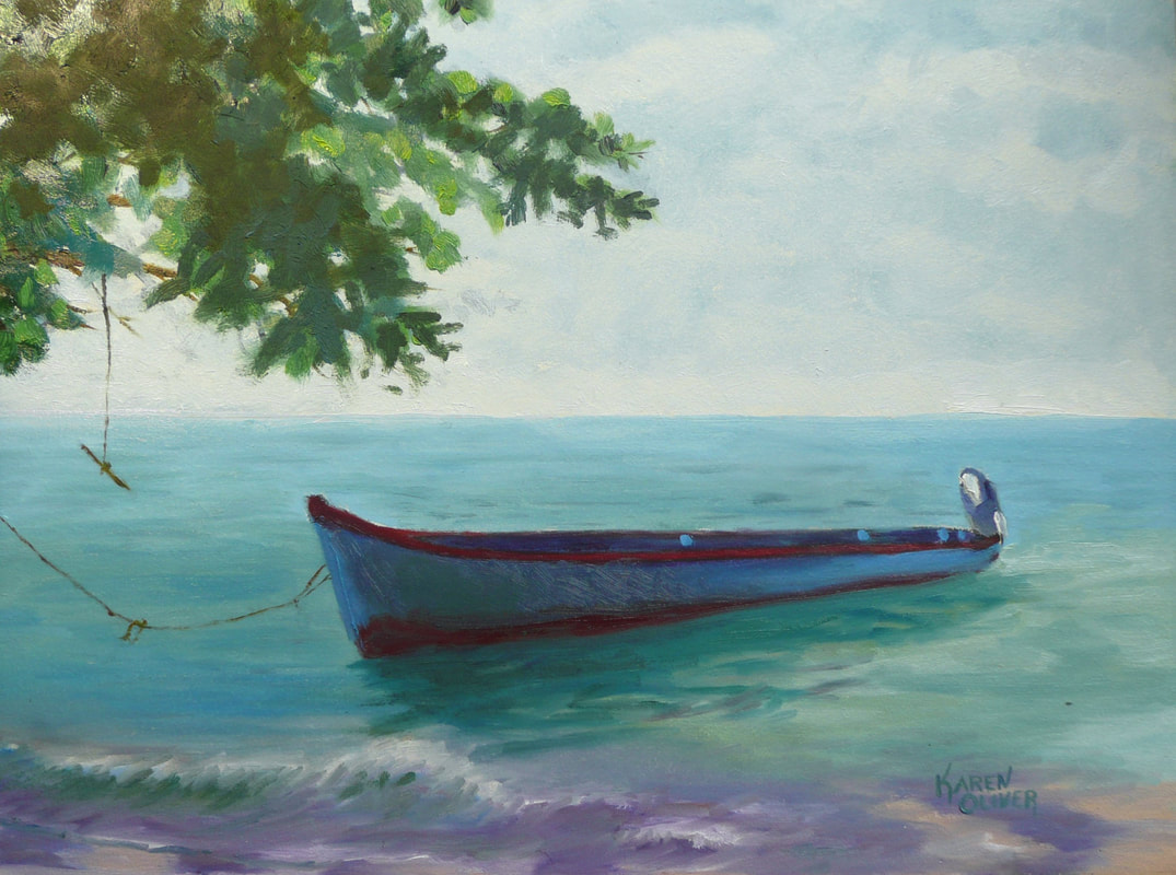 "Lazing In The Afternoon Sun" Oil on board, 12" x 16" #20018821A Water always draws me in and this view was no exception, especially the colours. 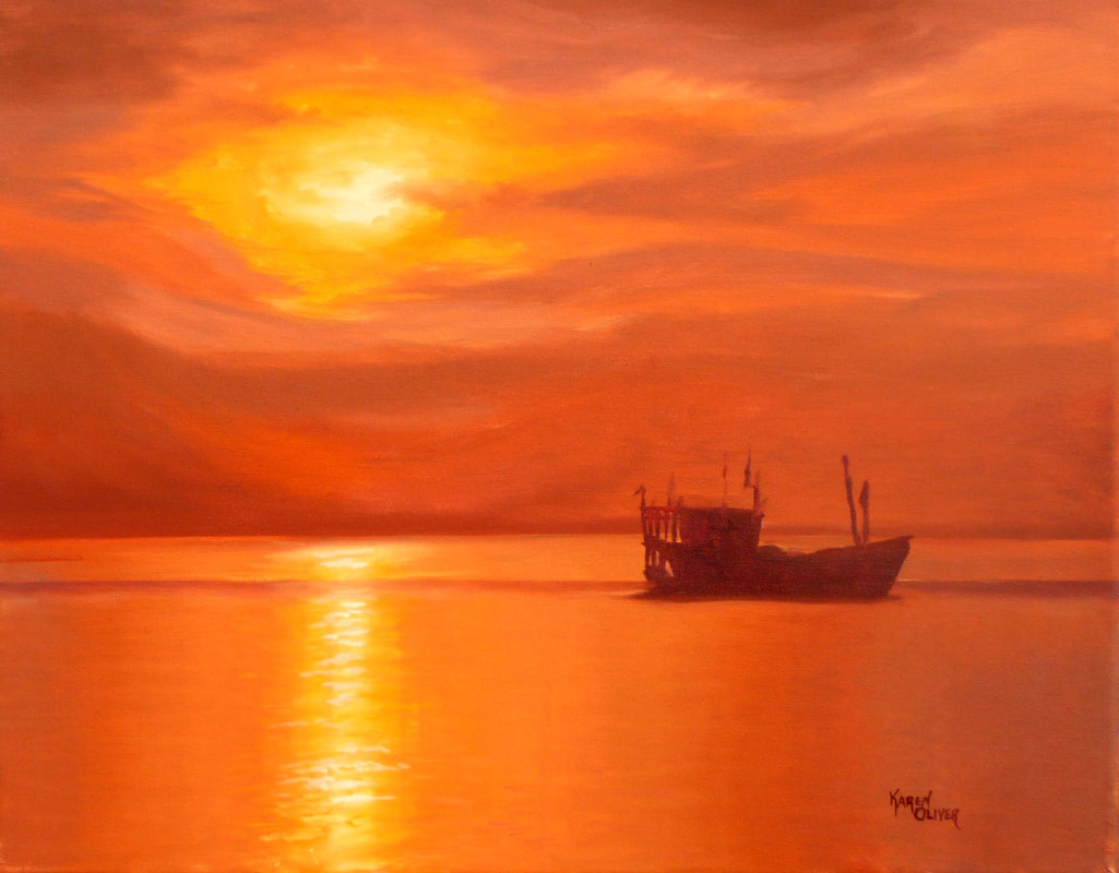 "Thailand Sunrise" Oil on panel, 16" x 20", framed #20018821B A trip to Thailand and our son's photo inspired this painting. 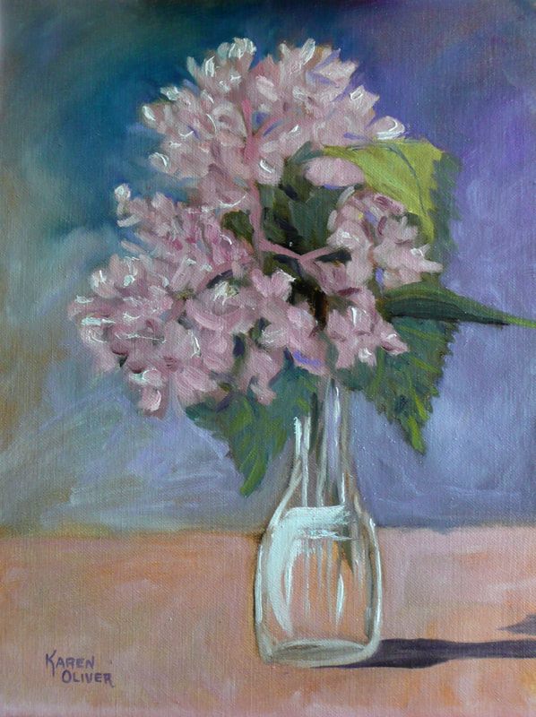 "Cabin Takeaway" Oil on panel, 16" x 12", framed #20017821C This was a flower I snipped out of Sue's cabin garden, a real beauty! 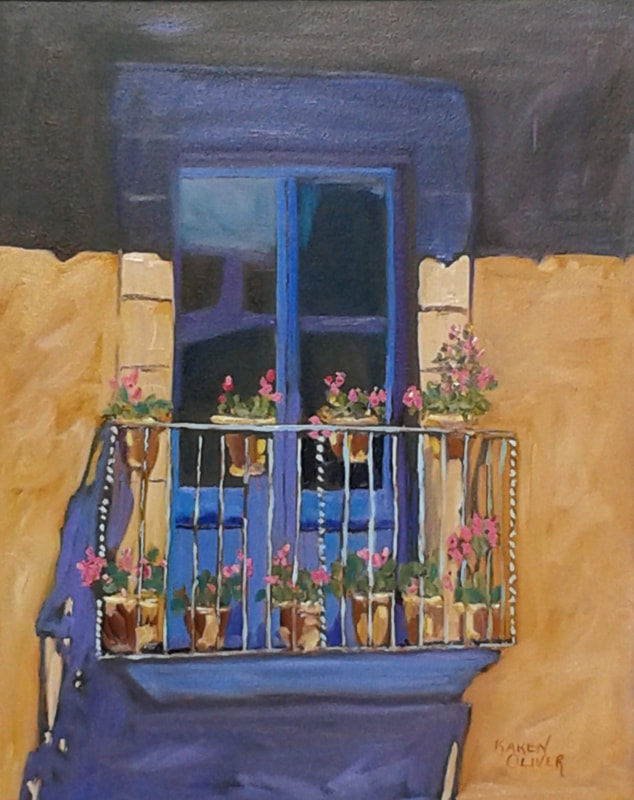 After everything was hung on her walls, she still had room for the "Girona, Spain Balcony" so the one above has found it's new home. It goes perfect in her bedroom with the blues bedspread colours. The ones above it have returned to Sicamous with me and will probably be in the Courtyard Gallery in Enderby B.C. for the September show. All my paintings have meaning to me and to see them again, brings them right back!
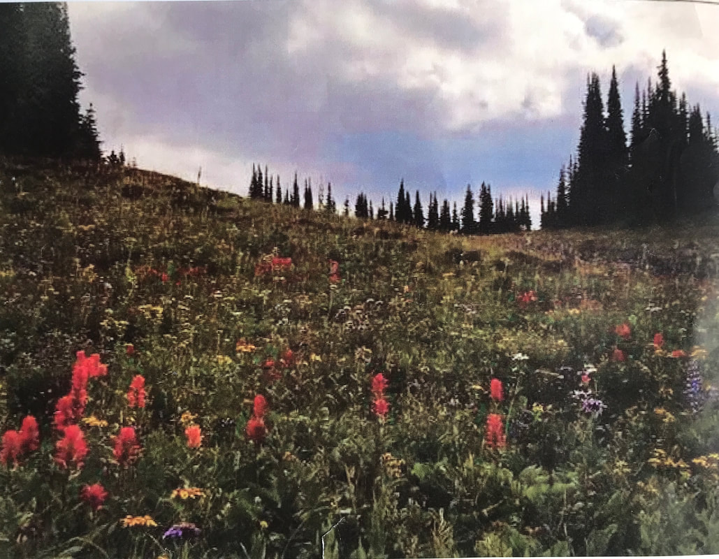
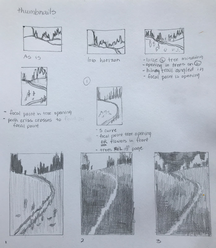
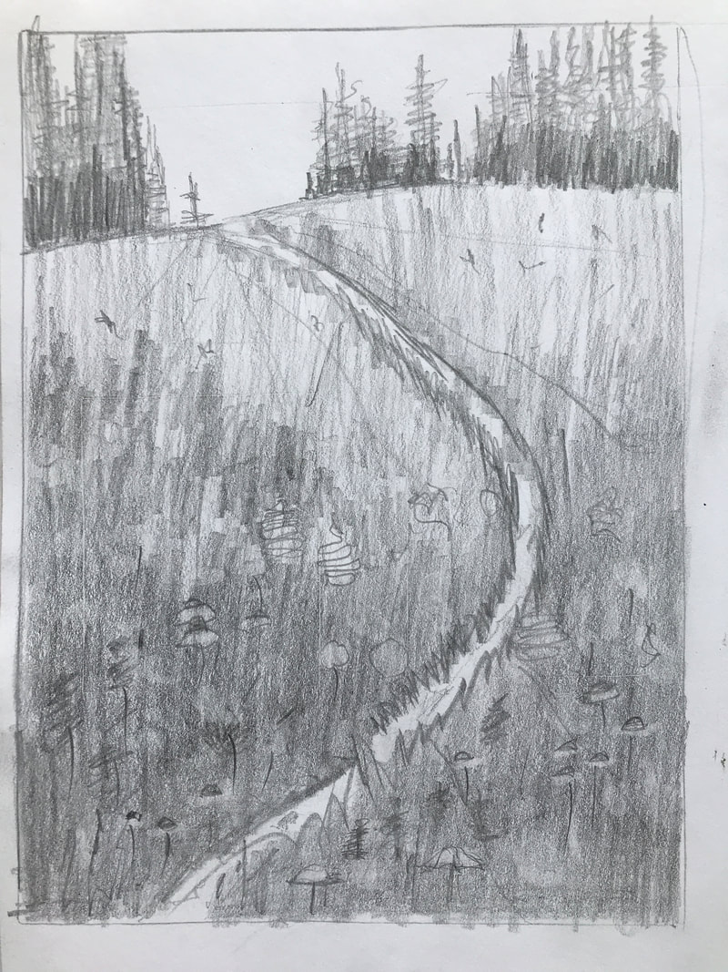
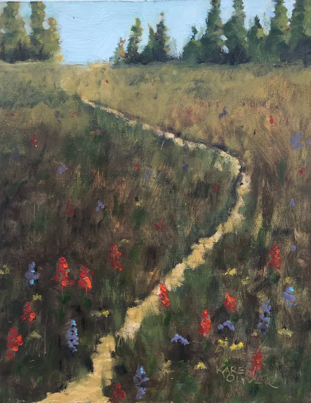 "Hiking Through Spring Wild Flowers" Oil on board, 14" x 11" #20005821 This painting was an exercise with an online art community I belong to, called 4C. I took a photo that I had taken, drew out "thumbnails" (Left below) of different views, changing anything I wanted in each of them. Choosing a favourite, then drawing it larger and putting in different values or shading to again find the one I preferred. The next step was to draw it out larger, with more details and the last one was to paint it. What really surprised me doing this exercise was that I preferred a portrait rather than landscape orientation even though the photo was in a landscape orientation. I really miss my hiking friends and miss walking on these hidden paths (not so hidden in my painting). I wanted the path I took on the hike to be more prevalent as you really can't see it in the photo. I finished the painting below, and the feedback I got was that I did not adhere to the thumbnails (lower right). I worked on the painting again to reflect my view (less sky, vary path etc.) with the finished painting above. A great exercise to do for every painting so you don't have to figure it out as you go...much easier to change you mind with a pencil and eraser. @karenoliversfineart #oilpainting #paintwithjoy #joyfulpainting #canadianlandscapepainting #landscapepainting #hikinhgtherockies #colourfulpainting #studiowork #expressive art
|
Karen Oliver's Art JourneyThanks for stopping by to see my art journey and what I am currently working on. Archives
July 2024
|

 RSS Feed