|
Colour Lesson #4 Doug Swinton sent his class members work to do on the colour wheel while we are not attending his open studio classes. I have looked at and read about the colour wheel but never really worked on physically making paintings limited to a monochromatic, analogous, complimentary triad etc. This lesson was on triadics - 3 colours spaced more or less evenly around the colour wheel. One colour needs to be dominant and the other 2 sub-ordinate keeping the colour within their respective value range. We can use the complement (opposite on the colour wheel) to grey our colours plus black and white. Yup, it was as hard as it sounds. Doug sent us the reference photo in black and white. 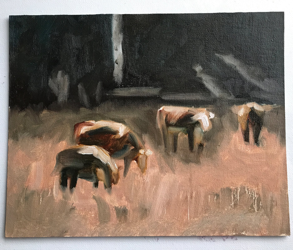 I set the timer for 30 minutes and begun. My chosen palette was burnt sienna, yellow ochre and manganese blue with burnt sienna dominant. I felt a little uneasy painting with the timer going as it hurried me up and I could not focus on the details (this is a colour study after all). I painted on a 8" x 10" canvas board in oil. Doug's comments: "10/10 Cool the background a bit more and it all come together. Use a more pure dark blue." I will try this one the painting is dry. My palette is below. 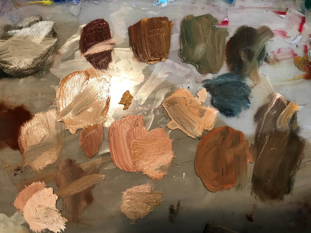 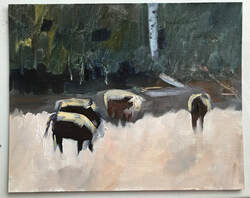 I found this second one harder although I thought it would be easier when I started. Again the timer was set for 30 minutes. This time I used Cadmium Yellow, Cadmium Red Light and Ultra Marine Blue. With only 30 minutes, the time flies and I felt the push to paint faster than normal without time for details. Red was going to be my dominate colour and I put it in everything but it doesn't read red as dominate, not as successful as the first one. I am learning a lot and am grateful for the opportunity, THANKS Doug!! Comments from Doug: "I think you're nixing your compliment in to much. You just need a touch to grey colours down. If you put in too much things start to get muddy." Back to learning.....
0 Comments
 Colour Lesson #1 -As our weekly studio classes with Doug have ceased due to the Corona virus, he has sent some "homework" that if we were interested in, we could try. We were sent a reference and then were to paint it monochromatic - 1 colour with black to darken and white to lighten. I really enjoyed painting this which surprised me as I am usually into colours. 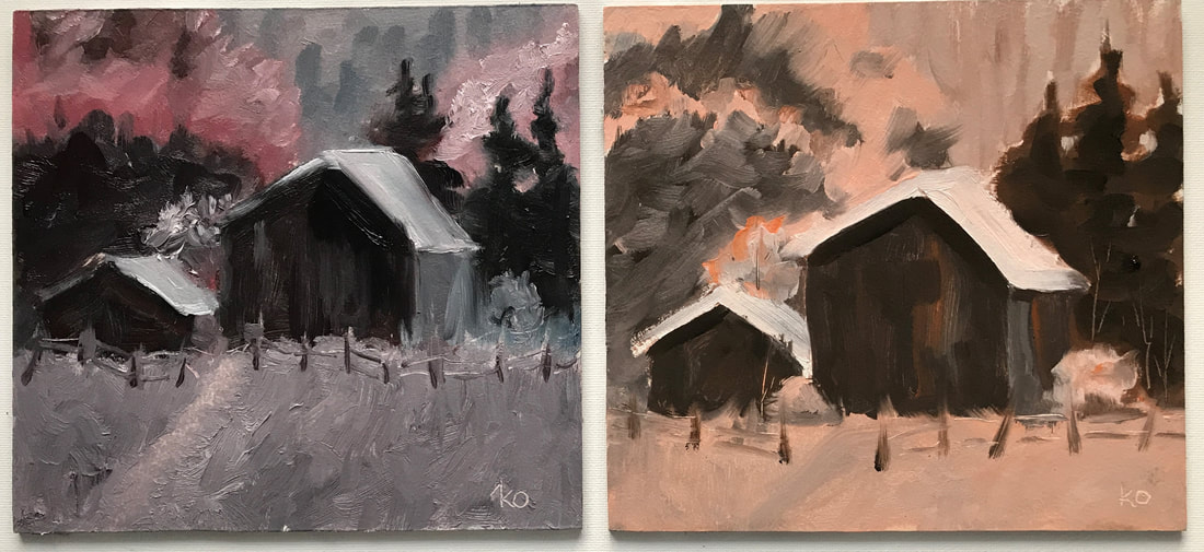 Colour Lesson #2: The paintings above were done monochromatic with one colour (red), the compliment to grey out (veridian green), black to darken and white to lighten. The painting on the left, I used to much of the black and used it more as a "colour" in the foreground. The second one I used orange in the intended way in the lesson with a little bit of the complement (blue) to dull the orange. These are meant to be no more than 30 minutes each. 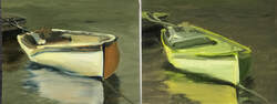 Colour Lesson #3 - In this lesson we were to use a triad (3 colours next to each other on the colour wheel), the compliment across the colour wheel, black and white. In the painting on the left I used to much of the compliment (red) and the shadowed part of the boat is not the triad colours (green, yellow-green and yellow). The second painting on the right I was more successful. These are a lot harder than they seem. These are painted on 8" x 10" canvas board.  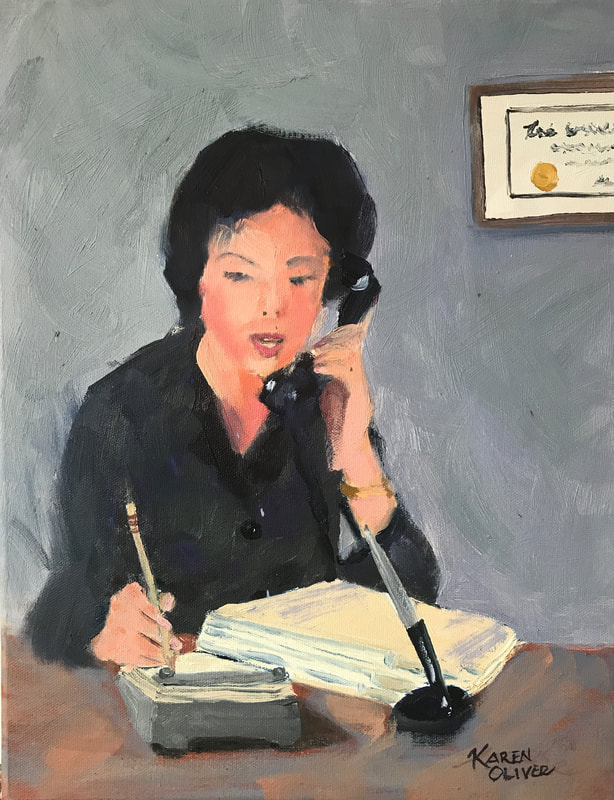 "Nine To Five" - Youth Remembered Series Oil on 1 1/4" thick canvas #20018320 For Sale This is the first in the "Youth Remembered" series I have been working on. With some of the TV shows being set in the 1950/60's I have been inspired to paint some of the moments of that time.
 "Looking For Batman 2" 16" x 20" Oil on canvas, #20003320 For Sale This painting was so much fun, I am sure I smiled all the way through it! Really fun colours were used including starting with a wild hot pink colour. I used whatever I could find to make marks with the paint (including spatulas from the kitchen)! The #2 in the title is because I have painted from the same photo reference once before and our son has it hanging in his house.
|
Karen Oliver's Art JourneyThanks for stopping by to see my art journey and what I am currently working on. Archives
July 2024
|
 RSS Feed